L-Moment estimation of Burr III parameters

The Burr family of distributions has been used extensively for over 20 years as a species sensitivity distribution (SSD) in ecotoxicology. Indeed, its popularity (at least in Australia and New Zealand) has been guaranteed by the fact that it is a default distribution in the Burrlioz software tool which underpins the methodology for guideline development (GV) in those countries.

The main advantages of the Burr distributions are (i) they can accommodate a wide variety of distributional shapes; and (ii) the cdf is readily inverted to provide a closed-form solution for percentile estimates (aka HCx values).

The down-side however, is that many toxicity data sets have characteristics that can result in numerical instabilities when maximum likelihood approaches are used to estimate the parameters of a Burr distribution. The problem is most acute when attempting to fit a 3-parameter Burr distribution to small toxicity data sets that are highly skewed (statisticians would walk away from such situations, but unfortunately, this is the norm in ecotoxicology).

We have recently been undertaking research into alternative estimation strategies and/or re-parameterising the Burr distributions to overcome these computational issues. A promising alternative to the use of maximum likelihood is estimation using L-Moments.

We have developed a simple, graphical-based method for the L-Moment estimation of the parameters of a Burr III distribution. The video below explains.

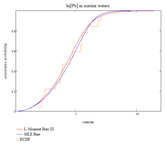
So what does this distribution look like and how does it compare to that obtained using MLEs? Figure 1 below says it all – the fits are very similar over the entire range of concentrations and almost identical where it matters – in the left tail and this is reflected in the HCx estimates of Table 1.

Figure 1. Comparison of Burr III distributions fitted to log-transformed Pb in marine waters data.
Burr III parameters:
{b,c,k}
HC1HC5HC10
MLE
{6.304,11.932,0.180}
0.7371.5602.155
L-Moments
{5.896,8.148,0.273}
0.7441.5342.095
Table 1. Comparison of HCx values from Burr III distributions fitted to Pb in marine waters data.

COVID-19: Modelling Explainer

So how did we obtain the predictions made in the previous posts? Well, it’s by a process of complex mathematical modelling. We won’t go into the details here, but instead will try to explain with the help of a few graphs for Victorian data. First – let’s look at the actual number of cases per day and the cumulative tally:

We next fit a complex mathematical model to the cumulative curve above. This gives us the red curves in the figure below. As can be seen, the model fit to the data is very good and so we have confidence in the results – although there is no guarantee that the actual trajectory is duty bound to follow our model!

So, it should now be clear how we got our ‘flat-line’ predictions – we simply extend the model out to future time and see what happens. But what about other questions like when was the rate of increase/decrease in reported infections the greatest? Or what was the predicted date of the peak in rate of infections? We could look to the data for answers to these questions, however real data tends to exhibit a lot of variability (as evidenced by the first two plots above). The advantage of a model is that it ‘irons’ out this variability. If you studied high-school mathematics, you might recall a topic called differential calculus. If we take the red curve on the left hand side of the last plot and differentiate its functional form, we get another curve that shows the instantaneous rate of change in the daily infection rate. An analogy is travelling in a car. The daily infection rate is like velocity or speed – it’s the number of new cases per day. Your speed is the number of kilometers per hour. The derivative of speed is acceleration – it’s the rate of change in speed per unit of time. So the derivative of our infection rate curve represents the rate at which the infection rate is changing. Here are the curves:

The blue curve above is our ‘acceleration’ in infection rate. It reached a maximum 61 days after January 22, 2020 – i.e. on or around March 23, 2020. On the other hand, the deceleration (rate of decrease) was greatest 72 days after January 22, 2020 – i.e. on or around April 3, 2020. The peak rate of infection is evident as the peak of the red curve, but it is also the point of zero ‘acceleration’ i.e. the point where the blue curve crosses the horizontal zero line. This was 66 days after January 22, 2020 – i.e. on or around March 28, 2020. So there you have it – mathematical modelling 101!

COVID-19 Australia: Revised model

Disclaimer: We have high levels of expertise in statistical modelling. We are not epidemiologists.

Modelling is an imprecise science. As renowned statistician G.E.P. Box once remarked “all models are wrong – but some are useful”. In our earlier post of April 5 (see below) we estimated that the number of diagnosed positive cases in Australia would plateau at 6,195 by April 20, 2020 (day 90 on the plots below). In a subsequent update, it was clear that while the individual state models were doing a reasonable job at describing the tested infection rate, some anomalies were emerging – specifically, Tasmania, WA, and, to a lesser extent, NSW. We have re-fit our models using all available data to April 12, 2020 and these results are shown in the plots below. Based on the updated model predictions, our revised estimate of the total number of diagnosed positive cases will be 6,706 by April 20-24, 2020. The state-by-state breakdown is as follows:

  • ACT: 104 cases; max rate of infection occurred on 28/3; estimated flat-line date=20/4
  • <predictions validated – actual # cases at 20/4 steady at 104>
  • NSW: 3,025 cases; max rate of infection occurred on 27/3; estimated flat-line date=23/4

<flat-line date predicted too early – cases still rising>

  • NT: 32 cases; max rate of infection occurred on 30/3; estimated flat-line date=20/4;

    <peak overestimated by 4 cases – actual # cases at 20/4 = 28>

    QLD: 1,035 cases; max rate of infection occurred on 27/3; estimated flat-line date=23/4

<peak overestimated by 9 cases – actual # cases at 23/4 = 1,026>

  • TAS: 167 cases; max rate of infection occurred on 4/4; estimated flat-line date=10/5
  • VIC: 1,354 cases; max rate of infection occurred on 29/3; estimated flat-line date=25/4

<flat-line date predicted too early – cases still rising (albeit very slowly)>

  • WA: 540 cases; max rate of infection occurred on 28/3; estimated flat-line date=24/4

<peak overestimated by 8 cases – actual # cases at 24/4 = 548>

Comment: Tasmania’s situation may be improving with only 2 new cases in the last 4 days. The situation in WA appears to have stabilized although 3 new cases have been reported in the last 2 days.

COVID-19: Model comparisons for Australia

Updated: April 11, 2020

Disclaimer: We have high levels of expertise in statistical modelling. We are not epidemiologists.

Please refer to our previous post for state-by-state predictions for the number of COVID-19 positive test results. We will add actual data to the graphs of model predictions to assess how well we’re tracking. The latest data are displayed below. The blue line is our fitted model; the solid red line are the predictions; the horizontal purple line is our predicted ‘stable’ level by 20/4/2020; and the green points are actual new data that was not available at the time the predictions were made.

Overall, the updated totals are tracking very closely to what was predicted, although the stand-out discrepancies are Tasmania, Western Australia, and to a lesser degree, NSW which still appear to be on increasing trajectories.

COVID-19 Australia – When will it peak?

Disclaimer: We have high levels of expertise in statistical modelling. We are not epidemiologists.

Based on a preliminary analysis of Australian data for the number of COVID-19 infections, we believe there has been a recent slowing down of the rate of infection. If this trend is maintained, we predict the total number of infections in Australia will stabilize around 6,195 by April 20, 2020. Specifically:

  • ACT: 101 cases
  • NSW: 2,795 cases
  • NT: 32 cases
  • QLD: 977 cases
  • SA: 425 cases
  • TAS: 86 cases
  • VIC: 1,296 cases
  • WA: 483 cases

This represents an additional 645 infections (from April 4) and, if we apply the current death rate to this number, that would translate to an additional 7 deaths. However, it is almost certain this figure will be exceeded with the announcement of a further 4 deaths in NSW as this post was being prepared. The Australian death rate (expressed as a fraction of known COVID-19 positive cases) is very low (0.6%) compared to other parts of the world – for example, the death rate in the UK is 10.2% and in the US 2.7%. Globally, the death rate at the time of this posting was 5.4%. Applying this to our prediction suggests the number of deaths in Australia could ultimately be as high as 333.

Actual number of cases (open blue circles) and model predictions (red line) for each Australian state/territory.